Collaborating with stakeholders to build a multi-brand website from the ground up.
The Challenge
Presented annotated mock-ups for both Kynesius brands, From Play to Z and Lifelong Living. These included the brand landing pages, About Us pages, and e-commerce pages.
Learning More About Kynesius
The DIA (Designing for Inclusion and Accessiability) team and I conducted stakeholder interviews to clarify the mission and needs of each brand, clarifying their distinct goals and target audiences. These were the key details they wanted:
- An accessible, functional website with two different brands
- Ease of use
- E-commerce function
The Brands We Are Working With:
- From Play to Z: Adaptive tools for children
- Lifelong Living: Products and services for the older generation
Mobile first - turning Ideas into Concrete Wireframes
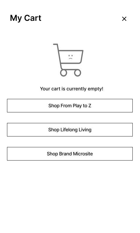
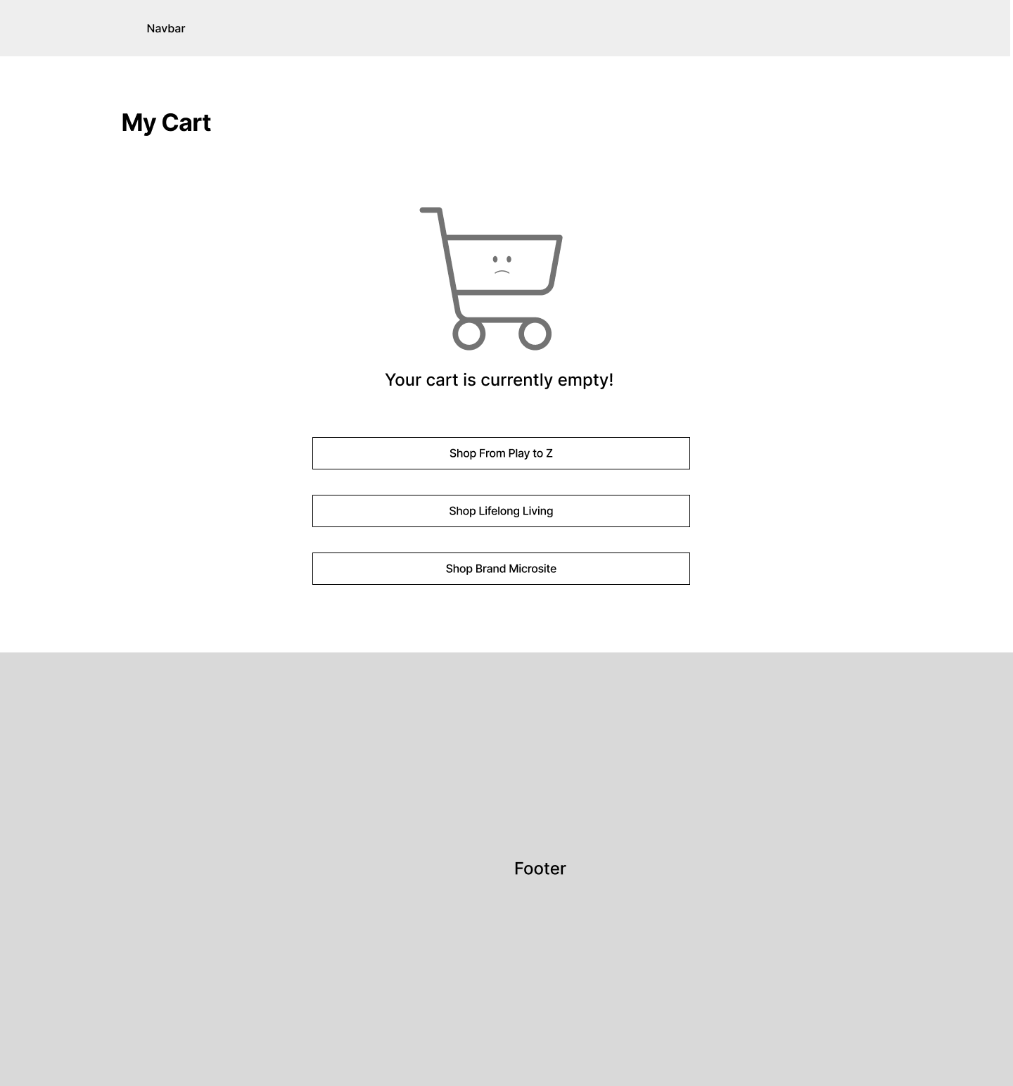
I worked on key areas of the website, including the brand landing pages, About Us sections, and cart pages at various stages. I designed for mobile first on the smallest possible screen - this gives me constraints to see what is truly necessary on the page, so that I know what to prioritize when I layout the wireframes for desktop.
Here are a few examples:
With no access to the rest of the site
Suggestions from Stakeholders:
- Cart
- Categorize items by brand
- Add inline product recommendations under each item
My Assessment of This:
- Categorizing by brand: Great for brand recognition.
- Inline product recommendations: Too aggressive in terms of sales, and could overwhelm users by making the page feel too long. This could discourage purchasing.
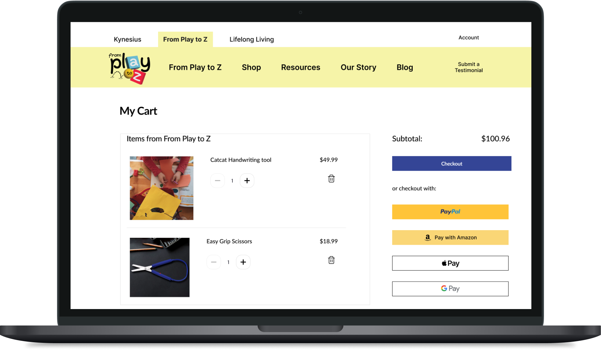
- Clear Overview: Shoppers can easily review and manage their selections, including quantities, prices, and any applied discounts. A focused, clutter-free cart enhances the user's ability to quickly assess their purchase.
- Reduces Distraction: Inline recommendations, while useful, can distract from the primary task—finalizing the current purchase. By keeping suggestions separate, you allow customers to concentrate on the items they’ve already chosen without additional cognitive load.
- Streamlined Checkout Process: With a simplified cart view, users can move toward checkout with fewer interruptions, leading to a smoother and faster transaction. This helps reduce cart abandonment rates.
- Better Control: Without inline recommendations, users feel more in control of their shopping experience, focusing solely on their selected items, rather than being prompted to add more to the cart.
Approaching with a Solution:
I created two quick mockups side-by-side:
- Stakeholder version: Includes inline recommendations, as requested.
- My recommended version: I categorized items by brand for clarity but removed inline recommendations to keep the cart concise and user-friendly.
This approach balances both stakeholder suggestions and user experience principles, ensuring the cart remains streamlined and encourages conversions.
Presenting the annotated prototypes:

Conclusion and live site:
Through continuous feedback and iterations, we successfully planned and designed a website that appeals to both younger and older audiences, improving both brand identity and the overall user experience for Kynesius.
The website is currently live and can be viewed here: https://kynesius.com/